Dozi Imp
Studio: Freelance
Team: Eleanor Robertson
Credits: Typeface, Emily Jing Sum Chan
Date: 2021


Dozi Imp creates unique hand embroidered items of clothing and home furnishings designed by textile artist Charlotte Des’Ascoyne. The designs celebrate the traditional craft of zardozi (an intricate type of embroidery with gold thread), incorporating images of imagined folklore and explorations of the female body.
At the start of 2021 Dozi Imp launched online with a collection of bags, but has ambitions to develop other lines, including jewellery, clothing, accessories and wall pieces. The brand is built on a foundation of sustainability and social responsibility. Each unique piece is produced with organic fabrics and natural plant dyes.

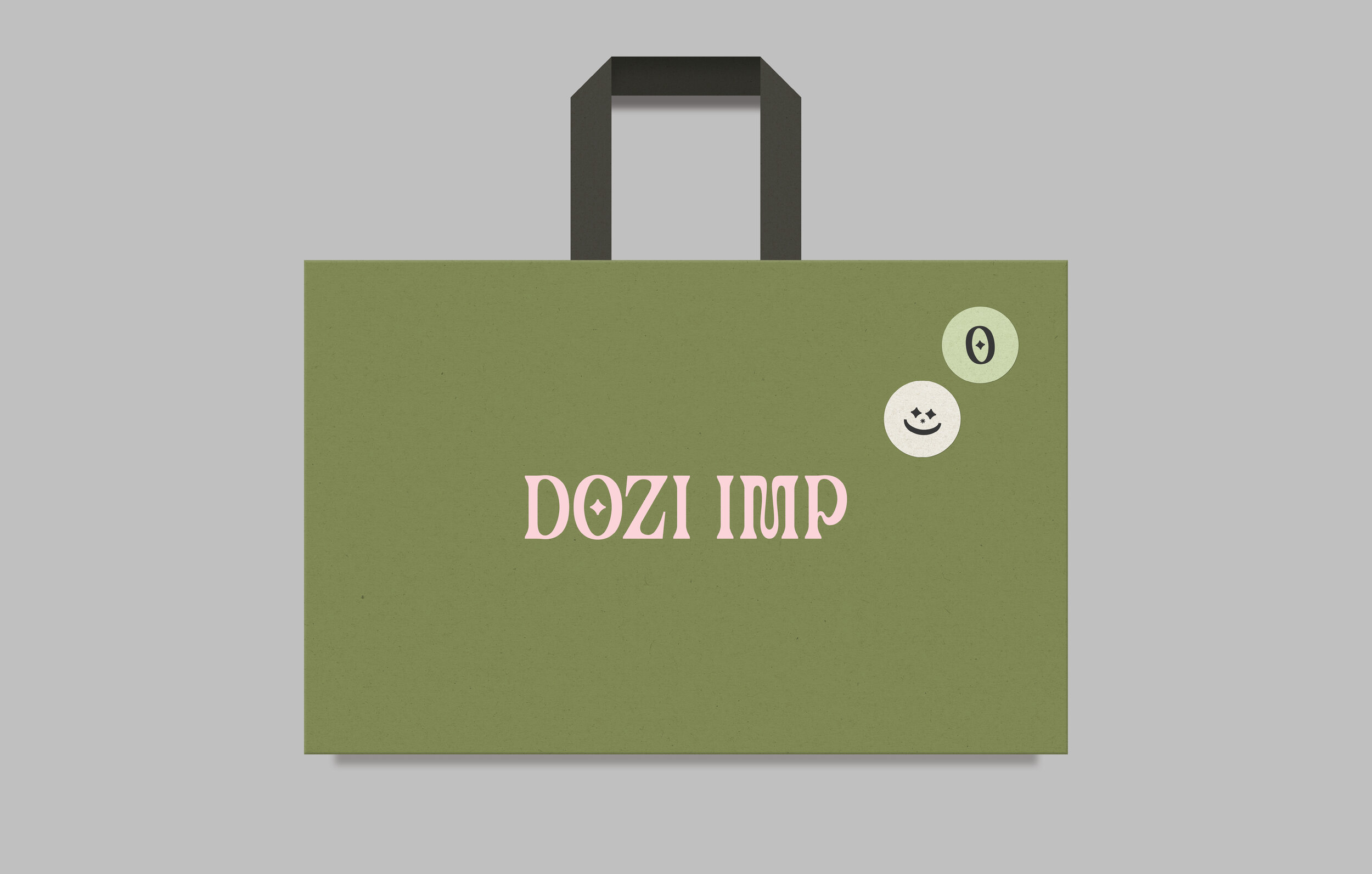
The wordmark invokes the mystical universe with a typographic treatment influenced by Art Nouveau calligraphy under a contemporary light. The distinctive letterforms, wedged serifs, intense curvatures and star-shaped ornament within the O act as contrasting elements to form the foundation of a brand language rooted in hyper reality, imagined mythologies and creative storytelling.
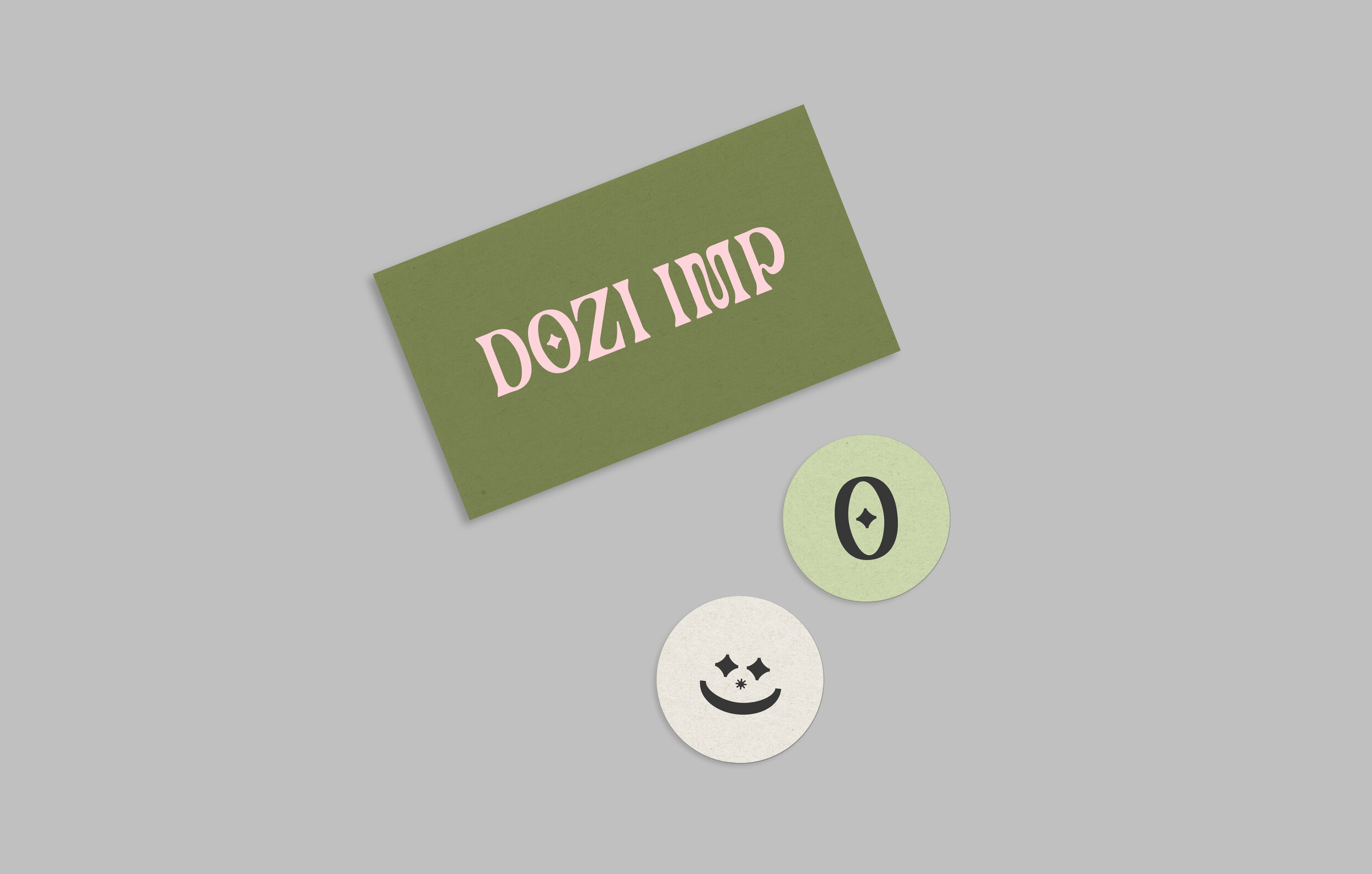
Where space is limited, a symbol can also stand in for the brand logo. This is taken directly from the Dozi Imp wordmark and represents the alchemical symbol for gold, referencing the gold and silver threads used in zardozi embroidery.


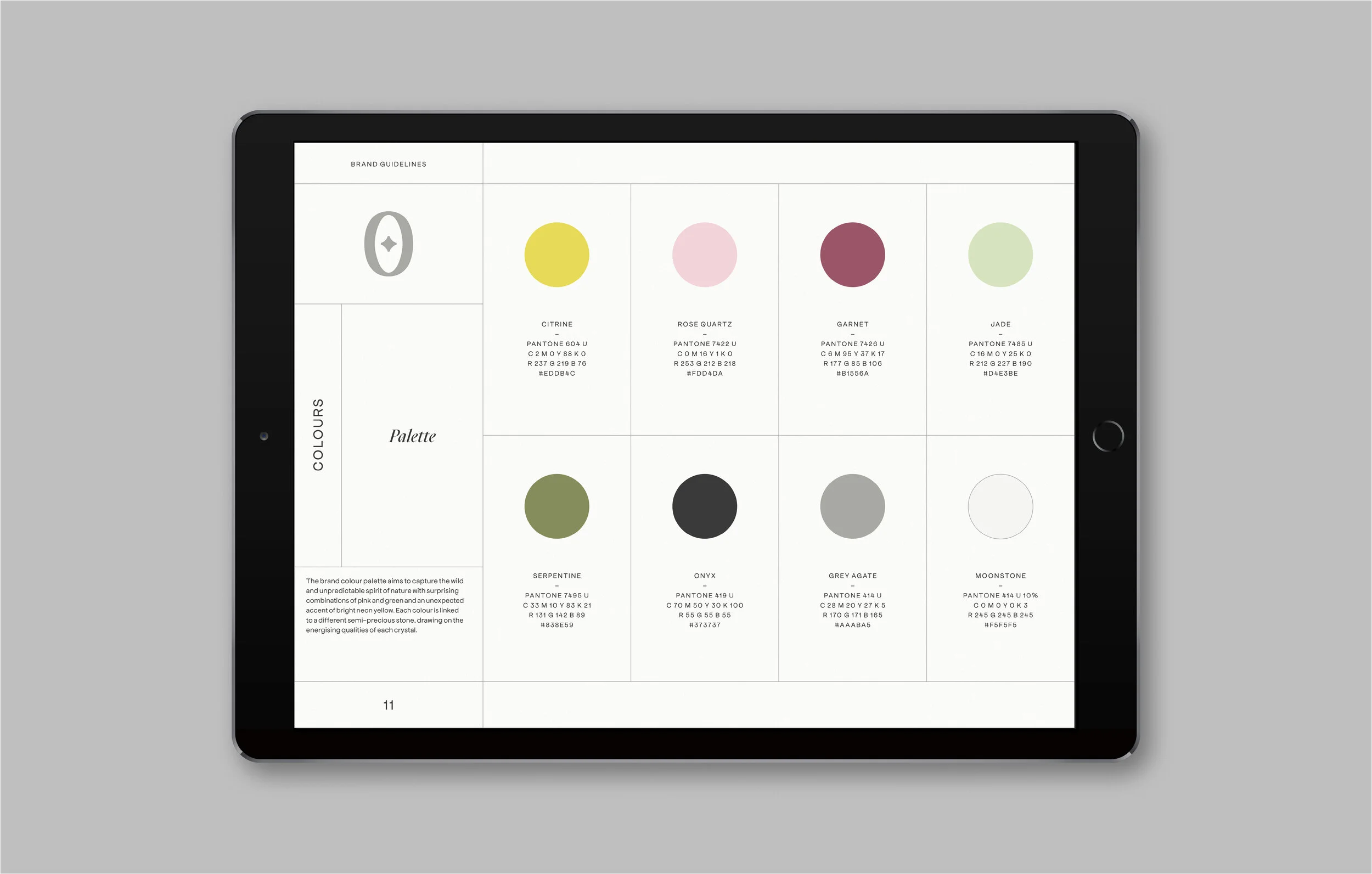
The brand colour palette aims to capture the wild and unpredictable spirit of nature with surprising combinations of pink and green and an unexpected accent of bright neon yellow. Each colour is linked to a different semi-precious stone, drawing on the energising qualities of each crystal.
The palette corresponds to papers from Fedrigoni’s range of Materica and Woodstock uncoated recycled papers, reflecting the brand’s commitment to sustainability and belief in the importance of social responsibility.

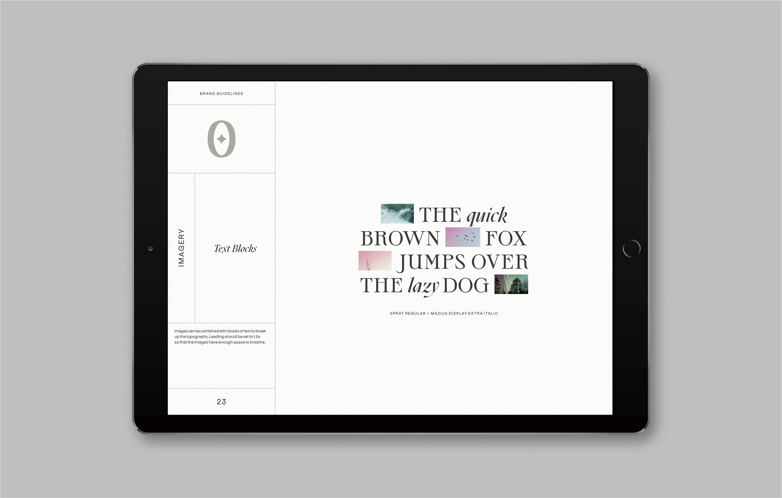
The brand uses three open source type families: Sprat, Mazius Display and Apfel Grotezk. Each family brings different qualities to the brand, drawing on several historical styles. When combined, these three typefaces create an expressive typographic language that is eclectic and playful.


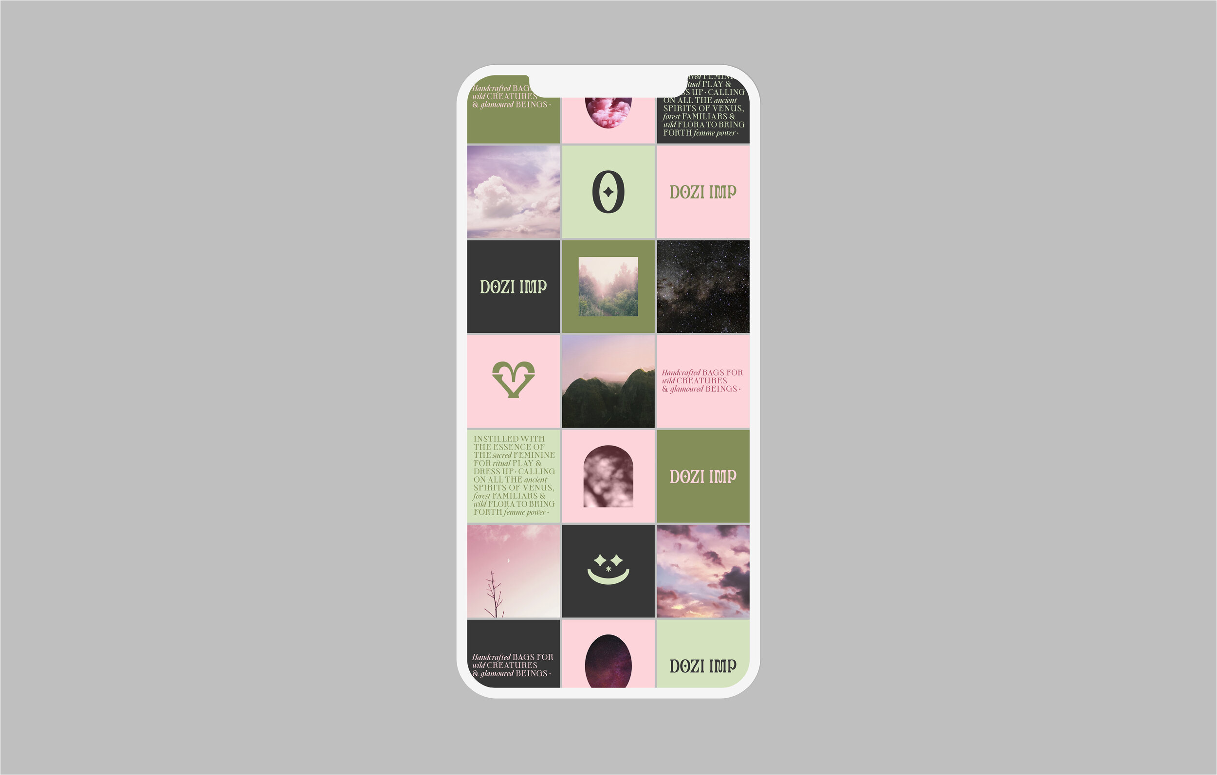
An archive of brand imagery evokes a dream-like quality, mixing the beauty of the natural and celestial world with elements of fantasy such as ethereal light effects, unreal hues and abstract perspectives. The visual style is linked to the brand colour palette but is not limited by it.


In print application the brand is equally playful, combining high-end materials and print finishes with stickers and custom emojis.


